Appmarq insight
Overview
Appmarq data - anonymized statistics collected across a large range of industry applications - is integrated into the Management Dashboard. It lets you judge a grade in context: not just whether a Health Measure looks low, but whether it is low compared with industry peers.
The integration is enabled out of the box. It can be turned off by an administrator - see Configuration options.
Appmarq data appears in two places, both at single-application level, both reached by drilling down from a Health Measure tile such as TQI, Robustness, Security or Efficiency.
Quartile indicator in Quick facts
The Quick facts section carries an Appmarq quartile indicator alongside the grade and violation counts:

It is a traffic-light summary of how this application compares with every application currently managed in Appmarq, for the Health Measure you are looking at. In the example above the fourth quartile is shaded, meaning this application sits in the bottom 25% of compliance ratios for that measure.
The value is derived by totalling the application’s compliance ratios for all rules attached to the current Health Measure, averaging them, then ranking that average against the Appmarq thresholds for the same measure:
| Average falls between | Quartile | Colour |
|---|---|---|
| Upper and max thresholds | 1st | Green |
| Median and upper thresholds | 2nd | Amber |
| Lower and median thresholds | 3rd | Red |
| Min and lower thresholds | 4th | Dark red |
Thresholds are percentage scales derived from the Appmarq data itself, so they can shift when new Appmarq data is integrated. A quartile can therefore change without the application changing.
Industry and Gap columns in Risk Profile
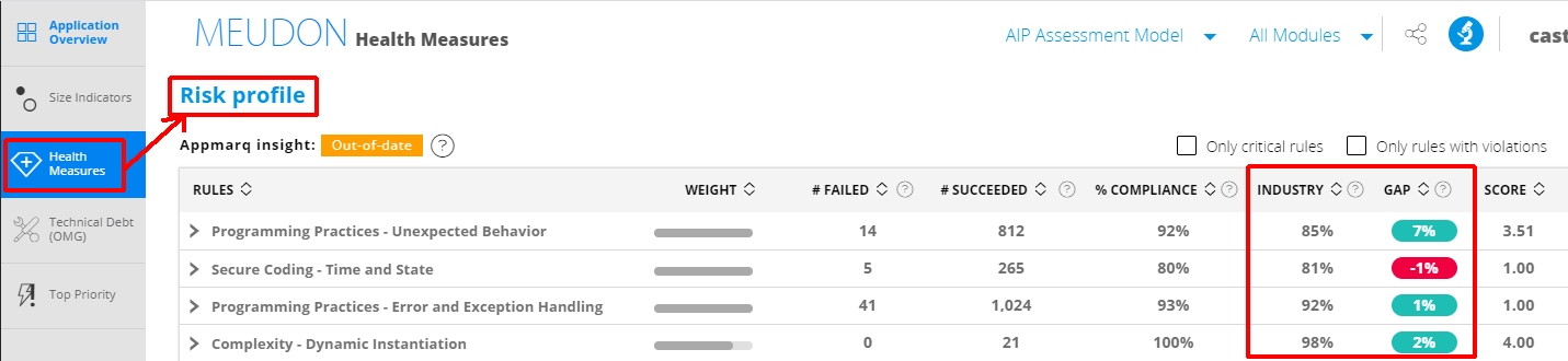
The Risk Profile section gains two extra columns:
| Column | What it shows |
|---|---|
| Industry | The average Appmarq compliance ratio for that technical criterion or rule, across all applications managed in Appmarq. Displays N/A while the Only critical rules and Only rules with violations filters are active |
| Gap | The percentage difference between the % Compliance column for your application in the current snapshot and the Industry column. A positive gap is green - you are ahead of the industry average. A negative gap is red - you are behind it |
How current is the data?
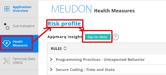
Appmarq data ships with the dashboard as a data file. It is marked up-to-date for three months from first use:
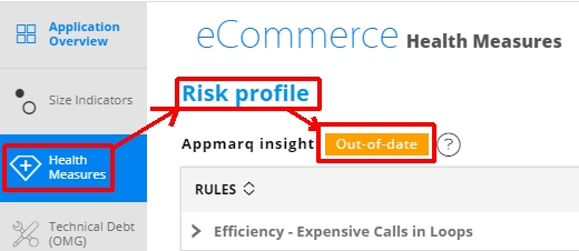
After that it is marked out-of-date. It remains usable, and the dashboard keeps working, but the comparison is against ageing industry data:
Refreshing the data requires an Appmarq subscription, which allows a new data file to be downloaded from Appmarq and integrated into the dashboard. No restart is needed once the file is replaced, but you should clear the browser cache and reload the page.
The location of the Appmarq data file differs between CAST Imaging v3 and the legacy standalone dashboard deployments the v2 documentation describes. Confirm the path for your installation with CAST Support before replacing the file.