Management Dashboard
Overview
The Management Dashboard answers one question: how healthy is this software, and is it getting better or worse? It reads the snapshots consolidated into the Measurement schema and presents them as grades, sizing measures and trends, either for a single application or aggregated across every application in the schema.
If you have not opened a dashboard before, start with Prerequisites, which covers the component, the license and the permissions you need.
Results appear on their own: publishing to the dashboards is a step in the analysis, so a completed deep analysis makes the application and its new snapshot available here without anyone doing anything. If results you are expecting are missing, the dashboards read from a server-side cache that may need reloading - ask an administrator, and see Reloading the dashboard cache.
What you see first
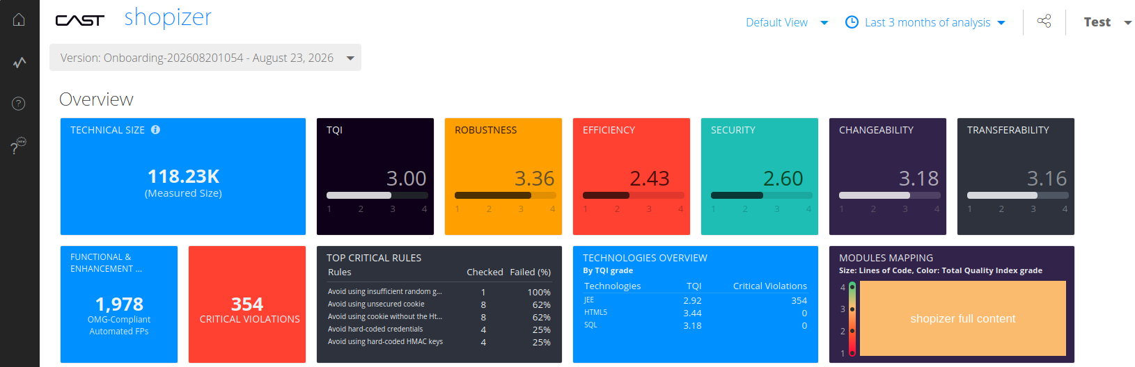
You arrive already pointed at an application. Open it in the landing page and choose View Management Dashboard: the dashboard opens on that application’s own single-application page, with its name at the top.
The home button in the top left corner switches to the multi-application page, which aggregates values across every application you are authorized to view:
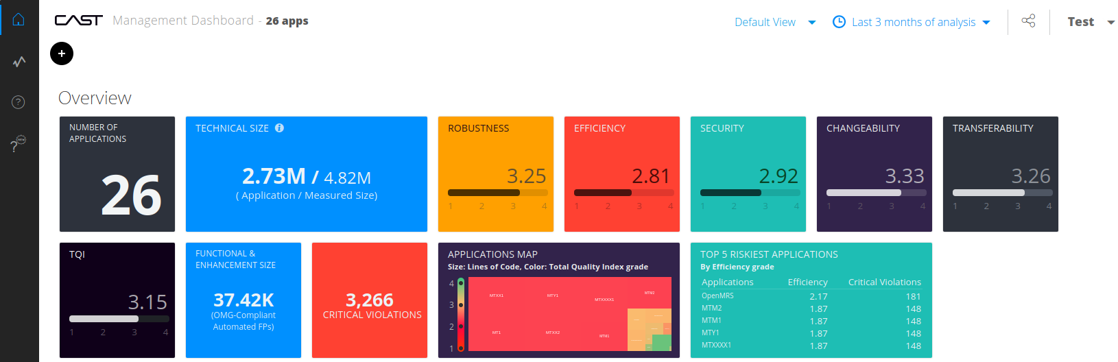
From there, the + button lists the applications available to you, and selecting one opens its single-application page:
Both landing pages are organised into the same sections, each covered in its own guide:
- Overview - the most recent grade or value for each measure.
- Trends - how each measure has moved over a history of snapshots.
- ISO 5055 overview - compliance against the ISO/IEC 5055 standard, when the required extension is installed.
- Automated Enhancement Point - function point and enhancement data, at application level and in the default view only.
Appmarq insight adds industry benchmarking to the Quick facts and Risk Profile sections when you drill into a Health Measure.
Switching between the default and ISO-5055 views
The Default View selector switches the tile layout between CAST Imaging’s standard measures and tiles built from ISO-5055 data:
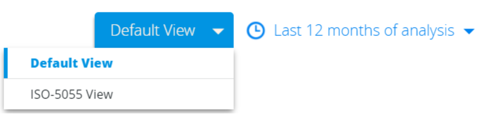
The ISO-5055 View option is only offered when at least one application has been analyzed with the ISO-5055 Index extension. See ISO 5055 overview.
Choosing what data is displayed
Several selectors control the scope of what you are looking at. Which ones are available depends on whether you are at portfolio or application level.
Snapshot
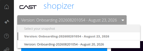
By default the dashboard shows the most recent snapshot: aggregated across all applications at multi-application level, or the latest snapshot of the application at single-application level. Once you are working at application level you can pick a different snapshot from the drop-down, and the page updates immediately:
Assessment model
By default the dashboard shows AIP Assessment Model and its Health Measure technical criteria. A second model, AIP Best Practices, is available out of the box and shows the legacy Best Practices technical criteria:

Further models appear in the drop-down when the corresponding industry standards index extension has been installed for an application and a new snapshot generated - CISQ, MIPS Reduction, OMG-ASCQM and OWASP.
Module and technology
At single-application level, drill-downs into Health Measures and Technical Debt (OMG) can be scoped to particular modules and technologies. All modules and technologies are included by default. Where there are many modules, use the search field to match on the characters you type:

Time period
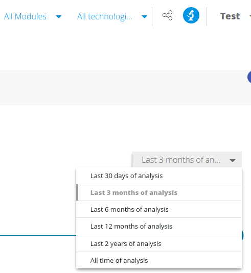
Evolution-based tiles in the Overview section and every tile in the Trends section show the last 3 months by default. The drop-down offers the last 30 days, 3 months, 6 months, 12 months or 2 years, or all time of analysis. Selecting a different period updates the tiles it applies to and greys out the tiles it does not:
Categories and tags
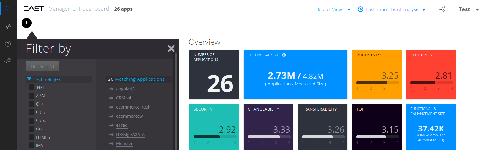
At multi-application level only, applications can be filtered by category. The + button opens the Filter by panel shown above, which does two jobs: it lists the categories you can filter on, and it lists the applications currently matching.
CAST assigns the Technologies category automatically, tagging each application with the technologies it contains - so an application containing Cobol source code is tagged Cobol.
Filtering returns results on a per-application basis: selecting ABAP in the Technologies category leaves only the applications containing that technology. Categories can also be applied inside the measure drill-down pages at multi-application level.
Additional categories can be defined by an administrator - see Tags and categories. If a category exists but no application carries a tag within it, filtering on that category displays “No values to display”.
Changing the display language
The dashboard ships in English. Where an administrator has configured a translation, Change Language in the user menu lets you select another locale. The choice is stored in the browser cache, so clearing the cache resets the dashboard to English, and only locales that have been configured appear in the list.